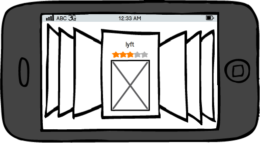
App Store Search Results Page
September 26, 2012While there were many improvements in iOS6, I do not find the new search page in the App Store to be one of them. After you enter a query, you now are presented with results one app at a time, rather than a scrollable list as in the past. I find this to be less efficient in finding a particular result, especially if there's a specific app you are looking for: this new UI would require more swipes than in the old interface if the desired app is located many results below the top hit.

Apple may be looking to showcase app screenshots so that the user has a better idea of what a given app is without forcing them to leave the results page, however I believe a hybrid solution can be more effective. The results page can be in a list format with the ability to expand any item to reveal its corresponding screenshot, without having to tap through to the app's page.
If the user is not sure exactly what they're looking for, perhaps Apple could apply the Coverflow UI to the search results page when the phone is held in landscape mode, which would allow the user to flip through app screenshots in a more exploratory manner.

Cover image credit: http://flickr.com/photos/matthewdeutsch/13923980809/
